Ok, so my time is up here at Creativeinspirationblog and I want to thank Kayleigh, Tara and Bailey for the honor and for the opportunity to spend some time here! :)
It's been fun and challenging!
There is nothing more fun than to add a little bit of bling when ordinary life seems just too ordinary - so my challenge this time is to dish out your best bling and stick it unto your page for that little added sparkle and glitter! It is sure to make you happy and feeling just a little glamorous! ;)
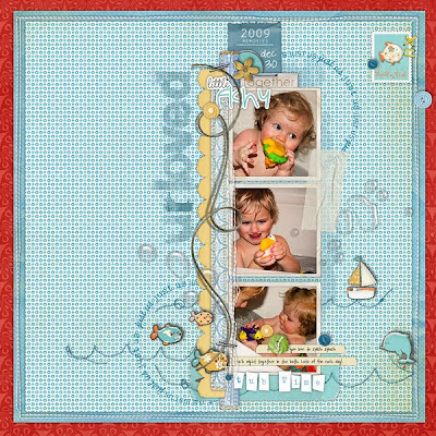
Here is my page with a bling - and thank you all very much!! :)
Sunday, February 28, 2010
Friday, February 26, 2010
Colour Inspiration No. 02
Today i am going to inspire you to create a page with a refreshing colour pallate. These colours can be used in various quantities on your page for a completely different look each time. Have fun playing around with this combo!
Here is the page i created using this inspiration. I used the colours in small quantities in the paper pieces. Of course the papers had to be stitched down!
And here are some products from the Designer Digitals store to get your mojo going:
- kayleigh
Here is the page i created using this inspiration. I used the colours in small quantities in the paper pieces. Of course the papers had to be stitched down!
And here are some products from the Designer Digitals store to get your mojo going:
- kayleigh
Thursday, February 25, 2010
A Photo A Day: Part 5
Hi everyone, I just got finished making Oatmeal Chocolate Chip Muffins for tomorrow for our play date with the Chang's. We are so looking forward to it. Don't you just love the internet. I love that I can hop on my computer and have a million recipes at the tip of my finger. Way too cool! :) How is everyone doing on their PHOTO A DAY? I was wondering. Do you guys have a certain way that you tackle it or do you just go with the flow? Please leave a comment and let me know. Here are a few more photos for February. Just think one more day until the weekend YAY! - Tara
Tuesday, February 23, 2010
Copy Cat Challenge #48
Today I bring you an awesome page to lift as well as a Photoshop tip. I was drawn to this layout by Emily because I love how she used so many pattern papers. I love pattern paper but just don't use it a lot in my layouts. I had fun searching my stash of supplies for the perfect papers. I also like this layout because she used irregular shapes for her pattern papers instead of the usual squares or rectangles. I've never used irregular shapes in Photoshop before and that's probably because I never knew how to do it. So Emily's page motivated me to learn something new. I googled how to make irregular shapes and found just the article to help me out. I tried using the pen tool before googling and found I just couldn't make it work. It was the right tool to use, but the problem was I didn't have my pen tool set up right. All I needed to do was have this clicked instead of that and away I went. Check it out HERE. I hope you have fun with irregular shapes & pattern paper. I can't wait to see what you guys come up with. Don't forget to link us up to your layouts in the comments field. I will post everyone's layouts next week. Happy Scrapping! - Tara
Click on layouts for CREDITS
Monday, February 22, 2010
Creative Challenge #46
Saturday, February 20, 2010
Quarterly Sale Going On At DD!
Designer Digitals is having their quarterly sale and you don't want to miss it. Save 30% on almost everything in the Shop. New products have been uploaded and more coming on Sunday. Sale Ends Tuesday February 23 at 6:00 a.m. Eastern Time. Today there is all day chats and FREEBIES & PRIZES! : ) Chats start at 8:00 a.m. Eastern and the last chat is at 11:00 p.m. See list of chats below. Hope to see you there! - Tara
8am Coffee Chat with CathyZ
9am Packaging Inspiration with Andrea
10am Photography Chat with Katrina
11am Web inspiration chat with Mindy
noon Template Chat with Pattie
1pm Ad Challenge - anna
2pm itunes Challenge Chat - Melanie
3pm 30MM Chat with Cassie
4pm Organizing Hour sponsored by ACDSee - sara horton
5pm Brushwork - Elena
6pm Scraplift chat - lynnG
7pm AAM chat with Steph
8pm Every Little Thing with Debbie Hodge
9pm Let's Blend with Katie
10pm Scrap in Kraft with Katrina
11pm Last Call with Randy & Katie
Here are a few new items in store:
Friday, February 19, 2010
From the sideline: Going in circles
Hi there! This is Aino again - hoping you are having a great weekend so far! :) This time around I want to focus on circles a bit.
I always find it hard to use circle frames and that is exactly what I challenged myself with this time. So here it goes....
So my challenge this week is to go ahead and use round frames, circular elements, brushes, text in a circular path - go ahead and go in circles!
Here are some products from Designer Digitals that might spur you on (and make use of this weekend's supersale!):
Thursday, February 18, 2010
Gallery Inspiration
If your feeling a little low on your creative mojo I have 8 layouts to spark your creativity. And if you don't already know Designer Digitals is having their HUGE quarterly CHAT & SALE. The sale has started and the all day chats are on Saturday. I hope to see you there. Have a great weekend. -Tara
This first layout is by Zara. Love the photo, such a GREAT idea and I love the pop of fuchsia.
This next layout is by Gonewiththewind. Her layout is so elegant. I love the layers and the shades of purple.
This layout is by Lizzyfizzy. Love the colour combo of Green, Purple & Blue. Her layering and element selection is PERFECT!
This layout is by Shawtyp. Her layout is simply adorable! Love the the greys with the hint of pink and orange. The design is perfect.
This layout is by Mungerre. Love her design and how the mustard yellow pops off the brown background. Such an adorable photo.
This layout is by Erica. Can I just say how COOL this layout is. Love the graphic feel.
Last but not least is by HeatherPrins. Again can I just say how COOL this layout is. Love the vintage tv. I'm going to have to steal this idea :)
'
Click on layouts for CREDITS
Tuesday, February 16, 2010
A Photo A Day: Part 4
It's a beautiful day here in Woodstock, the sun is shining and I have the urge to scrap. I can't believe it's already the middle of February. Did everyone have a fabulous Valentine's Day? We had a great one, it was nice having it land on the weekend : ) Here are a few of my photos for the month of February. I'm thinking I'm going to create a quarterly book featuring all my photos from my photo a day. As I said before some days will have more then one photo, but at the end of the year I should have 4 fabulous books to represent 2010. I've also included one of Crystal's favorite photos from her photo a day. I just love the reflections. - Tara
One of Crystal's favorite photo from January. Thanks Crystal for sharing :)
Sunday, February 14, 2010
Colour Inspiration No. 01
Hello friends, it's Kayleigh here to bring you a new type of blog posting. I am pretty stinkin' excited about this & hope you are too! Today I bring you a colour palate to spark your creativity. I've seen this idea a few other places & thought i would share a scheme with you. Try playing with the colours in various quantities on your page for different looks. A red background vs a neutral background will change the page completely. Also try playing with patterns to add more interest to your page.
Here is my page that i created using this scheme:
I chose blue as my main colour for the background paper. I used pops of red for a splash of impact & to keep the eye moving around the page. Then used the neutrals to ground the page. Try playing with the colours in various saturation's for more visual interest.
Here are few products that might help your mojo to get going, i found lots of great products available at Designer Digitals!
Have fun with this idea & let your mojo flow today. Please link us to your page here if you create a page using this colour scheme. Do you have a favourite colour scheme that you fall back to regularly? Or one that you are drawn too? - kayleigh
Subscribe to:
Posts (Atom)